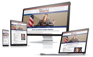
One of the best marketing tools a political candidate is a website. To put one together takes planning and work, particularly in putting together content. The quality of campaign websites vary as much as candidates themselves. Some are excellent, and some fail to hit the mark.
Below are some of the biggest website blunders we encounter.
Missing Critical Information – We’ve been through this previously, but we still see too many sites without enough basic information. Don’t forget to include the candidate’s name, elected position, location and election date. And if you want people to vote for you, please, please mention the election date. All of this information is critical for search engines to find your website.
Not Enough Quality Material – You may not be running for the elected position in the land, but you still need to convince voters to support you. At a minimum, your site should include a brief biography, reasons why you are qualified for the position, and a request for support. Address some major issues so voters know where you stand, but don’t overload your site with endless blocks of text. Break things up into digestible pieces so you don’t lose visitor interest. Subheaders and bullet points makes content easier to follow.
Not Adding Personality – You want your site to be professional, but that doesn’t mean that your website copy needs to read like a marketing-approved press release. Personal quotes and stories can help voters get to know and like you. On the other hand, being too personal or colloquial can be a negative.
A Lack of Compelling Images or Video – Compelling images helps communicate your story. Enhance your content visually to build your brand and show how your campaign is connecting with the community. How many words is a picture worth? Exactly!
Not Making the ‘Ask’ – Every page should have some call to action. Usually, it’s a request for a vote on a certain date. On a donation page, it’s a request for money. On a volunteer page, it’s a request for support. Don’t assume people know what you want them to do. Tell them! Ask them to donate. Ask people to follow your social media accounts. And most important of all, ask them to vote for you on Election Day. But don’t overload your pages with requests. Too many calls to action can be confusing to visitors. Specific landing pages for different types of traffic are more effective and have higher conversion rates when they are focused on a single call to action.
Spelling and Grammar Errors – This is pretty basic, but important. Would U vot for somone who spell liek this? Always have your campaign material (both print and web) double and triple-checked by outsiders for spelling and grammar.
Not Enough Promotion – It takes more than just a website and a donation page to raise money and win an election. What is your strategy for getting visitors to your site? Has the site been optimized for search engines? Will you run pay-per-click or retargeting ad campaigns? Will you use social media to keep supporters in the loop? Email is still a powerful way to keep in touch and grow your network. You need a strategy that extends beyond the website.
Online Candidate includes a complete system to easily create and edit your own campaign website. Clients have access to our full article archive, resources and tools at OnlineCandidateResources.com
« Sample Campaign Fundraising Letter – Online CandidateWriting Content For Your Campaign Website – Examples »


