A great logo design is central to a political candidate’s branding. It must be unique and stand out enough to establish a candidate to a wide audience. A well-designed political logo is a major element in projecting a professional brand in the minds of voters. Your branding can be a crucial component to fundraising and building a following.
Campaign logos provide a visual identity. They can be used on yard signs, candidate brochures, direct mailings, palm cards, video ads and all other forms of political advertising. An amateur-looking design reflects poorly on your candidacy and will keep voters from taking you seriously.
Table of Contents
- Political Logo Design Tips
- Current Design Trends
- Making Your Own Political Logo
- Sheriff Campaigns
- Judicial Campaigns
- School Board Campaigns
- Who Will Make Your Logo?
Our custom political website packages include professional logo creation – AND we’ll provide a FREE high-res version for your print materials.
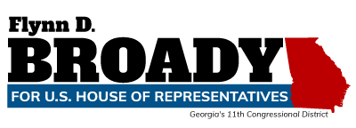
House of Representatives logo example with graphic in the design.
Tips for creating a winning campaign logo
One of the first steps to establishing your campaign branding is to invest time in your logo design. Employing visual elements such as color and fonts help voters understand your message and helps project a clear and consistent message.
Here are some tips to achieve the best look and layout when making a campaign logo.
Incorporating typography and text
Sans-serif fonts tend to dominate political communication. That’s no surprise, as sans-serif fonts tend to appear more conventional and project stability. Serif fonts, on the other hand, tend to appear more happy and casual. Script lettering is much harder to read and may not translate as well to print.
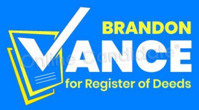
Here the first letter of the logo has been changed to a checkbox.
Choosing the right campaign colors
Choose your logo colors carefully. Many of our clients pick a red/white/blue flag color scheme. State or local candidates often match their state flag colors. Black and white or yellow are the most common colors for judges, sheriff, and law enforcement candidates. Odd colors like purple or pink may get attention but may also distract from the overall messaging.
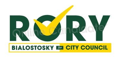
Campaign logo for city council in yellow and green colors sets it apart from the traditional political red and blue.
In the United States, it is traditional for political logos to have a red, white and blue color scheme. Blue is more popular for Democratic candidates, whereas red is significantly preferred by Republicans. To stand out, third party candidates often use other colors like green or orange.
The psychology behind branding
There is a psychology behind brand design. For example, the way a brand is designed with color can have a big effect on how voters see a candidate. For example, blue is often associated with trust, loyalty, and professionalism. In contrast, red is often associated with excitement, passion, and urgency.
Even the choice of font can influence how voters think of a candidate. Serif fonts, for example, are often associated with tradition. Using a traditional serif font in your logo may make you appear more reliable, established, and trustworthy.
Sans-serif fonts are often associated with modernity and simplicity. Sans-serif fonts are often used in websites and apps and are considered more legible in smaller sizes. Using sans-serif fonts in your logo can communicate a sense of innovation and progressiveness for your campaign.
These are just a few examples of the psychology behind brand design. By understanding how your voters might perceive these different design elements, your campaign can create a brand identity that will identify with your target voting block and help your stand.
Use symbols for better logo branding
Know the rules. Political campaign design often incorporates patriotic symbols or icons, such as an eagle, stars, political party symbols or state flags. You might not be able to include political party logos, either. There may be local rules or laws that prohibit what can appear on signage or campaign websites. Learn the restrictions on what you can and cannot include in your branding, so you don’t run into problems later.
Keep consistency in your design
Once you have your logo designed, don’t change it halfway through the race. A good part of voter branding is in your logo, and if you change it at some point, you’ll lose much of that connection.
NOTE: Your existing campaign logo design may not translate well to web. If you already have your print material created, it will probably need to be tweaked a bit to make it work online. For example, your design may have a border on it. That may look great on a sign, but it may look blocky when used in a website header. Sometimes we will remove borders or tweak the layout to flow better with a candidate’s head shot or background image.
The goal of great political design is for the average voter to immediately recognize your brand no matter where they see it.
Designing your own political logo
We strongly advise having someone with graphic design experience create your politician logo. Some people think they can save money and make a logo themselves, but often the results are amateurish. There may be spacing issues, or graphics not integrated well with the text, or layout is just too long or too tall. Sometimes the graphic element goes too far and makes the image look too complicated.
The best political campaign logos are simple enough to stand out, without being complicated with unnecessary elements.
Free campaign logo design tools
Free logo makers can sometimes do the job. They often include basic templates. But the image editor in a logo maker is only as good as the person using the tool. Also watch out – free logo generators only provides a low-res graphic for you. This can work fine for web purposes, but will look blurry in print. You’ll need to pay for a higher-resolution version that will scale for your printed materials, such as signs or brochures.
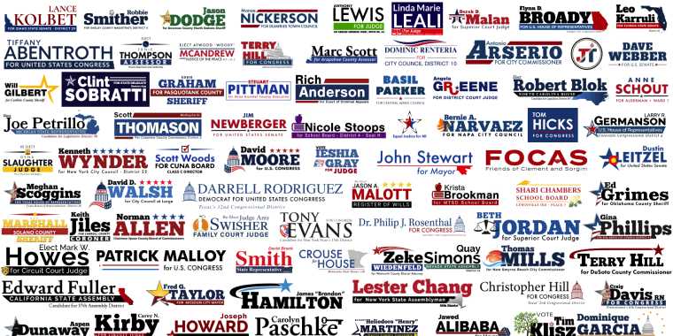
For inspiration, check out our own political logo examples.
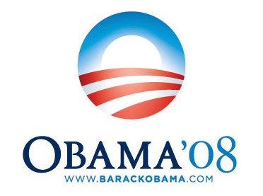
The “Hope” image, designed by artist Shepard Fairey, became an iconic image during Barack Obama’s 2008 presidential campaign.
Current political graphic trends
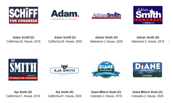
The Center for American Politics and Design (CAPD) collects branding designs for US House, Senate, Presidential and Gubernatorial races. The archive is a tool that allows users to filter and examine different graphic elements. It has been updated to 2020.
There has been more use of script and signature logos in recent years. They can be eye-catching, but should be used carefully so they remain legible.

Image and graphic elements are also added for visual interest. Incorporating a flag, state or federal building or even a state graphic is something we’ve done for years. Visual elements such as heartbeats for doctor candidates and bells and shields for ex-military candidates have become more common. We’ve seen an expansion in these types of elements in recent years.
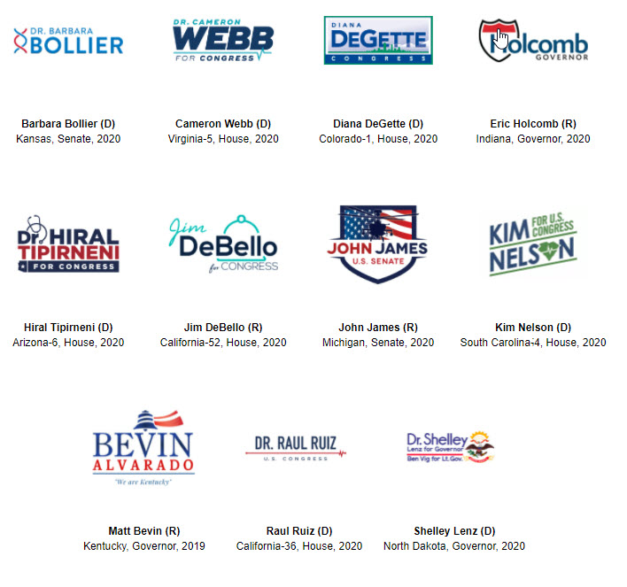
Boxes are still popular, and they’ve increased in popularity with Republicans – especially the stars along the top border. These work well for sign use, but sometimes it’s better to remove the outer box for online use, especially in the site header. Sometimes, the box is slanted at an angle, which gives the design a sense of movement and energy. This look started gaining popularity with Alexandria Ocasio-Cortez’s 2018 House of Representatives campaign. It’s been imitated by other progressive candidates, including a number of our own clients.
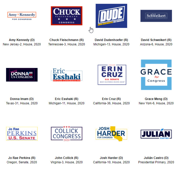
Some politicians perform a brand refresh between election campaigns. Here are a few examples:
Sheriff Logos – Stars and Badges
 Campaign logos for sheriffs tend to be ‘blocky’ with large lettering. Black, gold and white tend to be popular colors for law enforcement candidates. Sheriff logos often incorporate a six-point badge of some type (but not an official government badge). Sheriff candidates are often not allowed to even appear in promotional material wearing official law enforcement uniforms or insignias. Any badges that are used are often generic, or with identifying text removed.
Related: Sheriff Campaign Logo Design
Judicial Logos – Gavels and Scales
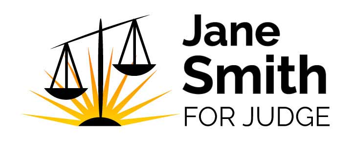 Logos for judges tend to be clean. They may have a gavel integrated into the logo, or there might be scales of justice worked in. Judicial logos tend to be dark and serious. Block lettering is standard. As they are nonpolitical, a judge logo is typically not the usual red, white and blue in traditional US politics. The overall look of the print materials and website tend to carry the look of a law firm – lots of blacks and whites with the occasional accent of color.
Related: Judicial Campaign Logo Design
School Board Logos – Mortar Boards and Apples
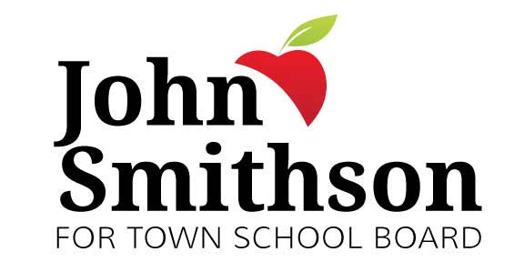
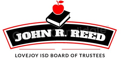
Simple images within a campaign logo can help tell a story. For example, an apple in a logo suggests a candidate for school board.
Logos for school board candidates can vary widely. They may often incorporate books, mortar boards or apples into them. School board logo colors often match the local high school or primary educational facility. If you have a particularly large school or high school that dominates the district, you may want to incorporate those particular colors into your branding.
Related: School Board Campaign Logo Design
Who Will Make Your Logo?
 Many smaller campaigns have their logo created by a print shop when they produce their first mailing. Others may have a volunteer make a design, or hire a professional graphic designer to do the job.
No matter who creates the design, you will want to have a high-resolution version to use for other purposes. This means the image is saved at 300 dpi in a jpg, tif, png, or eps format. High resolution makes it better for print pieces, such as mailers and signs.
Some of our clients already have their design assets when start their website. If client does not have one, or wants a better one, we will create a logo for them.
For graphic artists, we also provide customizable design templates. We offer downloadable Adobe Illustrator and Photoshop logo templates and a variety of Canva political logos.
Our Regular and Enhanced Political Website Packages includes free custom logo design and header. We’ll also provide high-res version for your print material. Why pay hundreds to have a designer do this? We’ll make one for you – and it’s included with your website.
« Squeezing The Most From Your Campaign Landing PagesWhen a State Flag or Local Emblem Causes Trouble »
Tags: personal branding

