 Over the seven years that we’ve been building political websites, politics online has taken a lot of different turns. Social media, blogging, online donations and the adoption of video have really changed how candidates and voters interact. With these changes in technology there have also been changes in political website design trends and styles.
Here are some of the biggest changes we’ve seen since we started political web design in 2003:
Site width
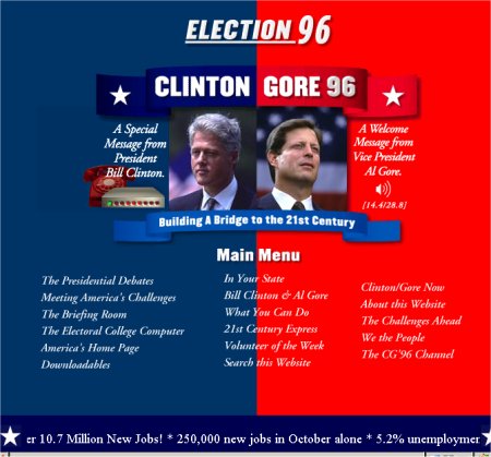
Around 2003, the average monitor was set at a 800×600 pixel resolution, which meant that our campaign websites were built at 780 pixels wide or less, so the entire site could be seen without left or right scrolling.
As of last month, less than 2% of visitors to this website had a screen resolution of 800X600 or less. Our typical site is usually 1100 pixels wide, though some candidates request even greater widths. One reason we don’t recommend going too wide is that it become difficult to read the content of the pages when each line of text is 40-50 words long. It’s easier for users to read in narrow columns.
Website headers
Because of the average screen resolution, you didn’t want to have a head that was too deep. Anything deeper than 150 pixels started to take up a lot of space. Over the last few years candidates have requested much larger headers on their sites, along with larger candidate photos.
Navigation
Years ago, our site navigation text was usually bold in a narrow column. This was more the style of the times than because it looked particularly well. In 2010, we’ve seen a dramatic shift in design requests. Color rollovers are still popular, though the trend has been for the navigation bar to be wider with larger text. A few of our recent sites have the navigation appearing as large ‘buttons’ that roll over with alternate colors. The larger donate and volunteer buttons that a lot of national political sites favor probably influence this style. In some cases, the entire site needs to be widened to accommodate this design.
Colors – red, white and blue
Red, white and blue are still favorite color schemes for US campaigns, though the colors tend toward darker reds and more purple blues. Some candidates go for greens or yellows. We always try to match their campaign material or create a complementary color scheme.
Text and copy layout
We’ve always encouraged our clients to use bullet points in their copy, organize text with sub headers, and use images to break up areas of text. These days most of our clients do a great job in laying out content. (In the past, sometimes not so much.) We’re always glad to help tweak body copy if someone needs help, because when the design and content both look good, it all comes together!
Other web features whose popularity has faded include text in multiple colors and reverse backgrounds, blinking text and those annoying web counter buttons that proudly display to the world how many ‘hits’ your page has. But one thing that’s increased over the years are the donation buttons… they seem to be everywhere now!
What other political changes online have you seen over the years?
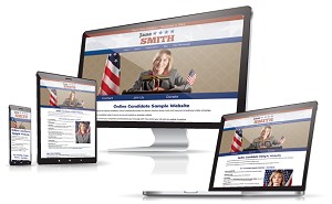
Check out a selection of our own more current political website examples.
Related: Political Web Design: A Primer
« Political Pay-Per-Click Advertising IdeasCandidates Need Money So Badly, They’ll Spam Anyone To Get It »

