When putting together your campaign brochures, you want to put your best foot forward. Your brochure may be the first, last, and only time you will reach a voter. Here are tips to creating an effective election brochure that will make a good impression on your target voter.
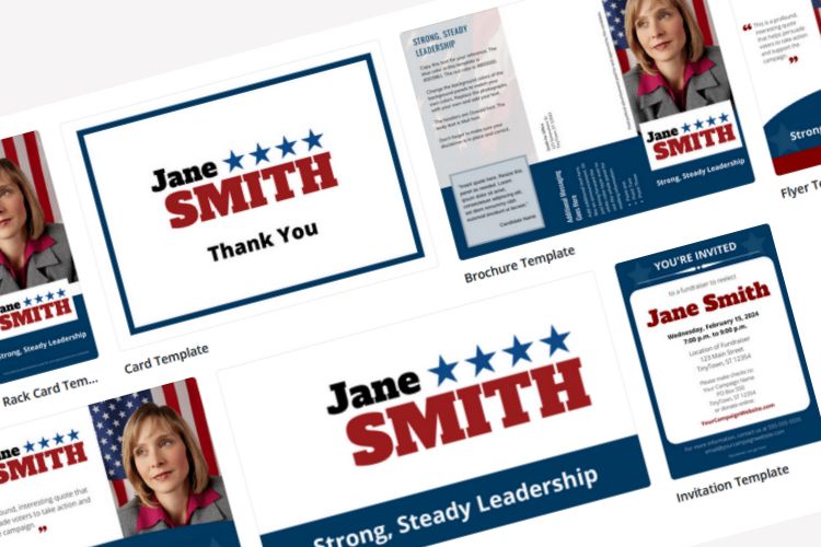
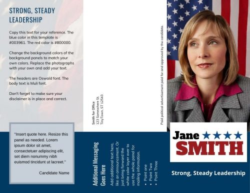 Sample Brochure Layout – Click For More Political Brochure Design Examples
Write out your content, while keeping in mind the amount of space you have to work with. Odds are you will start with way too much text, and you’ll need to cull down the material.
That’s fine, because you’ll want your copy to be as lean and to-the-point as possible.
Keep in mind the overall design and layout of the brochure or political pamphlet. For example, if your piece is tri-fold brochure mailer, two-thirds of one side will be for address information and the ‘cover’ on the other side.
In the brochure copy itself, try to:
- Keep to one idea per paragraph.
- Use short sentences.
- Use bullet points where possible to free up as much white space as possible.
- Use headers and divide the text into sections (About the Candidate, Issues, Voting Information/Election Date…)
- Include a call to action. This is usually a reminder to vote on Election Day or perhaps a statement about the candidate or the opposition.
- These guidelines apply for both candidate and political party pamphlets, election leaflets, campaign handouts and flyers.
What makes a good brochure design?
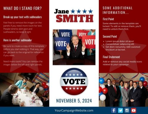 When designing political campaign brochures, keep the layout simple. Be sure the main colors of the brochure match your other campaign materials, yard signs, and website. Script fonts should be generally avoided for readablity. Keep in mind that using more colors adds to the cost of printing.
Make sure the front panel is attention-getting
The front of your leaflet should communicate your main point clearly and succinctly. If it doesn’t, your carefully-crafted literature may end up the recycling bin, unread. You may want to use a question or powerful statement on the front of the piece to draw attention.
Photographs provide powerful visual elements
Political brochures should include at least one photo of the candidate. Typically, a professionally-shot candidate photo should appear on the cover, along with an ‘action shot’ inside. All the photos should make the candidate look good with proper dress and backgrounds. The last thing you want potential voters to do is to scrutinize the candidate’s fashion sense or the corporate logo of some item in the shot’s background.
A picture can tell a thousand words; charts and graphs can do the same
Your graphics should be simple in design and clearly illustrate a point. A simple explanation under the chart should be all you need to make your point. Images for the sake of taking up space only serve to distract from your piece.
As your election pamphlet design is finalized, it’s likely that you (or the designer) will need to adjust the different elements to make everything fit and flow properly. If there is too much text, the font size may need to be adjusted or the graphics or photos re-sized. You may need to further condense your copy.
A cramped brochure looks bad and is less likely to be read.
Put together your content
You have limited space to place your content. The purpose of your brochure will determine what, exactly, the content will contain. Writing an introductory piece to voters is different than a get out the vote or an opposition attack piece.
If the piece is to convince voters why you should be elected, you should spell it out for them.
- List your experience and offices you previously held as a candidate.
- Briefly include your accomplishments and activities.
- Keep your message short and to the point.
- Balance out the copy with additional testimonials or endorsements.
If you are writing about a particular issue, keep your points bulleted and short. You may want to include relevant quotes from others who have a stake in the issue or legislation.
Include additional campaign information.
- Your campaign website
- Contact information
- Email address
- Social media channels
Remember, you have limited space. Don’t stuff too much text. Plenty of space in your layout helps makes your brochure easier to read.
Finally, proofread the brochure for misspellings or grammatical errors
Have a few people review the piece for readability. Preferably, they should be people who were not involved in creating the print piece. That way they have an objective point of view.
Tip: From professional experience we’ve found that it’s better to limit the number of people involved in writing and editing the brochure. Campaign material created by committee tends to be unfocused, as the brochure, flyer or pamphlet ends up trying to cover too many points in a single piece.
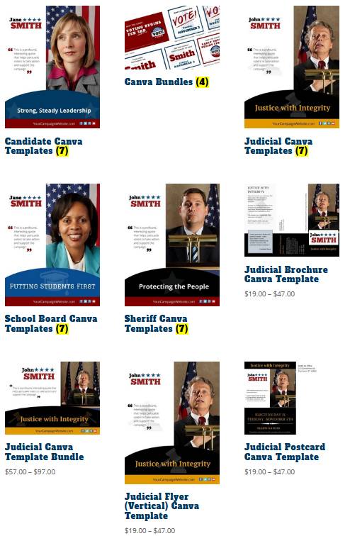
Canva political template examples from our download store.
We have versions for local candidates, school board candidates, judges and sheriffs.
Printing your campaign brochures
If you are having an outside company print your brochures or pamphlets, check their printing requirements and be sure to provide everything they need. They may need a particular format and image resolution. Images and design elements should beat least 300 dpi.
Tip: Web images are 72 dpi, so don’t use graphic elements from your website in a print piece.
The post office can inform you about requirements that must be met for mailing brochures. For example, are there are specific size or bulk mail requirements? The USPS considers election mail as any item mailed to or from authorized election officials or organizations.
Finally, upload a digital version of the election brochure to your campaign website so that it is available for others to download, share and print. Don’t forget to add it to your online press kit.
Bonus Tip: If you are looking for campaign literature examples, look no further than your mailbox. Create a political swipe file and save the good brochures, mailers and pamphlets sent by other candidates as examples for inspiration.
Free up your valuable time! Our easy-to-customize Canva Political Templates will add a professional edge to your campaign brochures and handouts. Online Candidate website clients have access to FREE editable social media graphics.
Dealing With The Local Media When Running for Office »

