Political design is a form of marketing to influence voter’s opinions or behaviors. It is used in election campaigns, advocacy websites, and organizations. The goal is to persuade their audience in a way that benefits the organization or candidate.
The best political graphic design makes a candidate or organization stand out through a custom color palette, brand message, and imagery.
Main Highlights
- Clean, clutter-free designs with appropriate color schemes and typography choices can effectively convey political messages and resonate with target audiences.
- The “hero image” is central to first impressions, requiring high-quality, candidate-focused visuals that establish professionalism and identity.
- Beyond design, clear presentation of the candidate’s stance on issues, background, endorsements, and voter resources are essential for an effective political website.
- Persuasive design combined with current trends, like simplified homepage designs, video usage, catchy imagery, and responsive layouts, ensures optimal viewer engagement and accessibility.
Read on to learn more about the aspects of good website design and how Online Candidate can help you achieve this.
- Clean, professional design = Powerful message
- Choose the best colors for your political website
- Fonts can impact a website’s aesthetic
- Pay attention to your images and graphics
- Including the right content matters
- Features and functionality
- What are the latest trends in political web design?
- Conclusion
Clean, professional design = Powerful message
Local political campaigns, such as for city council and mayor, are usually less costly and smaller in scale than national or state-wide races. They are often used as stepping stones for candidates who want to run for higher positions in the future. Congressional races can also be seen as local, but they typically have more funding and publicity due to their size.
Design is one of the most important aspects of any political website. It is what makes the site visually appealing, aesthetically pleasing, and easy to navigate. Elements such as color, fonts, and even layout can help convey political messaging.
Your look should be clean, clear, and concise – all attributes that are valuable to any candidate running for office. A cluttered design will cause visitors to bounce off the site and go elsewhere.
How to choose the best colors for your campaign
Choosing a color scheme design is a crucial element when you start your campaign. Colors evoke emotions and greatly reflect a candidate’s personal brand or organization’s identity.
Color psychology plays a significant role in determining how voters perceive you. The color you choose for your design may depend on your political affiliation. For example, Republican-leaning websites are often more likely to use reds while Democratic-leaning sites are more likely to use blues and greens.
Some of our clients find picking the right colors to be tricky, but here are four good design guidelines to follow:
- Choose colors that match your campaign brand identity.
- Avoid clashing colors. This may draw attention, but for all the wrong reasons.
- Choose complimentary colors for accents. This will not only make it easier on the eyes, but it will also help you stand out from other sites with similar color schemes.
- Make your call-to-actions clear by using contrasting colors and fonts.
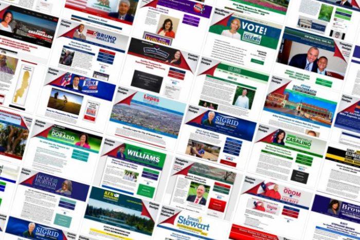
Political website colors often go beyond the traditional red, white and blue.
Fonts can impact your overall aesthetic
Typography is an important part of branding. It can give a logo and website personality and make it more attractive to the eye. Fonts are often overlooked in the design process, but they can have a substantial impact on a website’s overall aesthetic. They can help convey values and emotions to your readers.
Serif fonts have small lines at the end of letters, which make them easier to read in print and on screens. Sans-serif fonts are much cleaner and simpler than their serif counterparts. You may notice that most political logos use a sans-serif font because it is easy to read and works well on campaign signage. Script fonts are much harder to read at a distance. Many designers will choose one typeface family as their primary font style and then use secondary fonts to complement it.
To target more conservative audiences, consider using more blocky sans serif fonts like Arial or Verdana. When targeting more liberal audiences, consider using serif fonts like Times New Roman or Georgia. These are broad generalizations, of course. Modern typefaces and fonts such as Open Sans, Oswald, Roboto and Alfa Slab One are very popular today.
For example:
- The Alexandria Ocasio-Cortez website splash page uses Roboto Slab for the headers, and Metropolis for the body font.
- Joe Biden’s site uses MercuryMedium for the headers, and DecimalBook, sans-serif for the body font.
- Donald Trump’s siteuses Montserrat for both the header and body text.
One way that we figure out which font to use on a client’s site is by finding out what font the candidate uses in their campaign print materials. If they use a unique typeface, then we try to incorporate that specific font into their website.
With Online Candidate, you can choose one font for headers and a separate font for the body. We typically use two fonts for custom designs, as well.
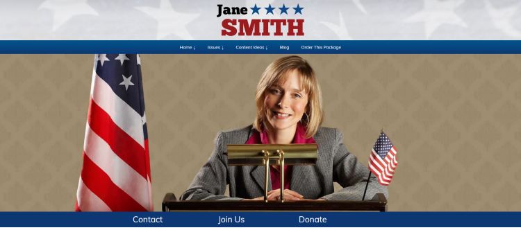
Sample wide hero image on a political website home page.
Pay attention to your images and graphics
In digital marketing, you can’t go wrong with images. They are an important part of your content and they should be used in a way that is eye-catching and grabs the attention of your audience.
The hero image is the first thing that people see when they visit a website. If you are looking to use a head shot of the candidate to use as your hero image, here are design tips:
- Create a well-designed logo. It must be unique and stand out visually to establish a candidate to a wide audience. (Our custom design packages includes a campaign logo design.)
- Make sure your images are clear and in focus. High-resolution images are best for web designers to work with.
- Avoid a group shot. It is not as good as an individual image, because it takes away focus from the candidate. Save group shots for interior pages.
- Don’t just use any photo. Make sure your candidate hero images present you in a professional way.
- Photoshop is your friend. Use graphic design software to color correct, sharpen and improve your images. A little touching up can go a long way.
Invest in some good campaign photography for high-quality, high-resolution imagery. Images need to be professionally taken and have a good resolution. However, many of our clients have had success using their own pictures that taken from a smartphone.
Online Candidate provides a library of open-source images for you to use. We also provide access to free graphics and Canva templates to save time and make creating the visual aspect of your site and print materials easier.
Including the right content matters
Clever design is not enough for a political website. No one ever voted for a candidate because of a flashy logo or color scheme. What the candidate stands for is equally important. That means the design of the site also requires content that fleshes out who the candidate is, how they stand on the issues, and how their policies will benefit the voter.
Political candidate sites should have the following sections:
- A home page that acts as the hub of the website
- A bio or about page of the candidate
- The stances on various issues, usually over multiple pages. The information in this section should be easily accessible and easy to understand for voters.
- A list of endorsements and supporters
- A volunteer page for those who want to help
- A donation page for those who want to contribute
- A voter page that provides links and resources for early voting and information on upcoming elections.
- An online press kit for reporters and the media.
All of the content on a political web should be easy to find and read. Many of the pages listed above come pre-built with our system. If you are looking for additional website content for inspiration, we have copy samples for politicians, judicial, sheriff and school board campaigns.
The layout of your homepage matters, too!
A visitor’s first impression of a site is made almost immediately, so the homepage design is critical to how users will perceive your campaign. The homepage should include a photo of the candidate. This can be in the site header, or in a hero image below the site navigation. Most home pages include personal information, such as the values the candidate represents, what matters most to them, and what they stand for politically.
Some campaigns use a simple home page layout, focusing on the calls to action. However, if you save information about the candidate for the bio page, you may have that page rank higher in the search engines than your home page.
Pro tip: Include relevant calls to action throughout your site, which could be something like “Register to vote”, “Donate”, or “Get updates”.
How to achieve politically persuasive design
Persuasion is a powerful tool in both web design and politics. It can be used to influence the audience and convince them to take an action. The goal of political web design is to shape public opinion through persuasive design. This can be done by using persuasion techniques to promote a specific message or ideology.
Persuasive web design incorporates the following key elements:
- A clear message that promotes a candidate and his or her positions on the issues
- Clear, concise copy with headlines and subheaders that makes the message readable
- A clear call-to-action that informs visitors what they are supposed to do (Ex. Vote for me, Subscribe, Follow Us on Social Media)
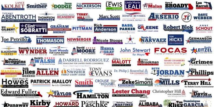
A good website design begins with a creative logo.
The latest trends in political web design
There is no formula that will help you create the perfect political website design, but there are trends that most campaign websites today seem to follow.
- Home pages often have a ‘hero shot’ which may be a large image with the candidate just under the navigation bar.
- There has been a trend toward simplification of images and text. Sliders are out, as is unnecessary clutter, too many animations or flashy graphics which can distract the visitor from the message.
- Many campaigns are using video in their home page to attract viewers to their site and get across their message.
- Another trend that has caught on over the last election cycle is using simple and catchy images to represent a particular party.
- In 2021, we started seeing the return of QR codes!
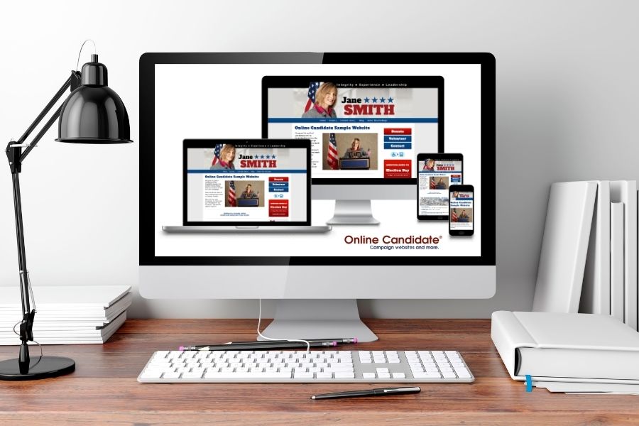
The layout of the website applies not only to where images are placed or text flow, it also on a technical level. In a responsive layout, a webpage adjusts to fit different screen sizes without having to change the webpage’s code. This ensures that your website is viewable with all devices and all browsers.
Conclusion and final thoughts
A good website is an important tool in any political campaign for candidates running for local, state, or federal public office.. The way that a website is designed can make or break the outcome of the election. Campaign websites should be designed to be politically savvy and provide voters information about the candidate’s stance on different issues.
At Online Candidate, we’ve been doing political websites since 2004. What package is best for you?
Related:
« Why Your About Page Ranks Higher Than Your Home PageReach Early Voters Online: Mail-In and Absentee »
Tags: graphic design

